Detailed guides from basic operations to advanced features.
Visualize project data with charts
Repsona visualizes project status and activity with charts. This article explains the chart screen and how to use it.
| Who can use it | Available on |
|---|---|
| All | All |
Chart screen
Click "Charts" in the project menu.

Repsona currently provides three types of charts:
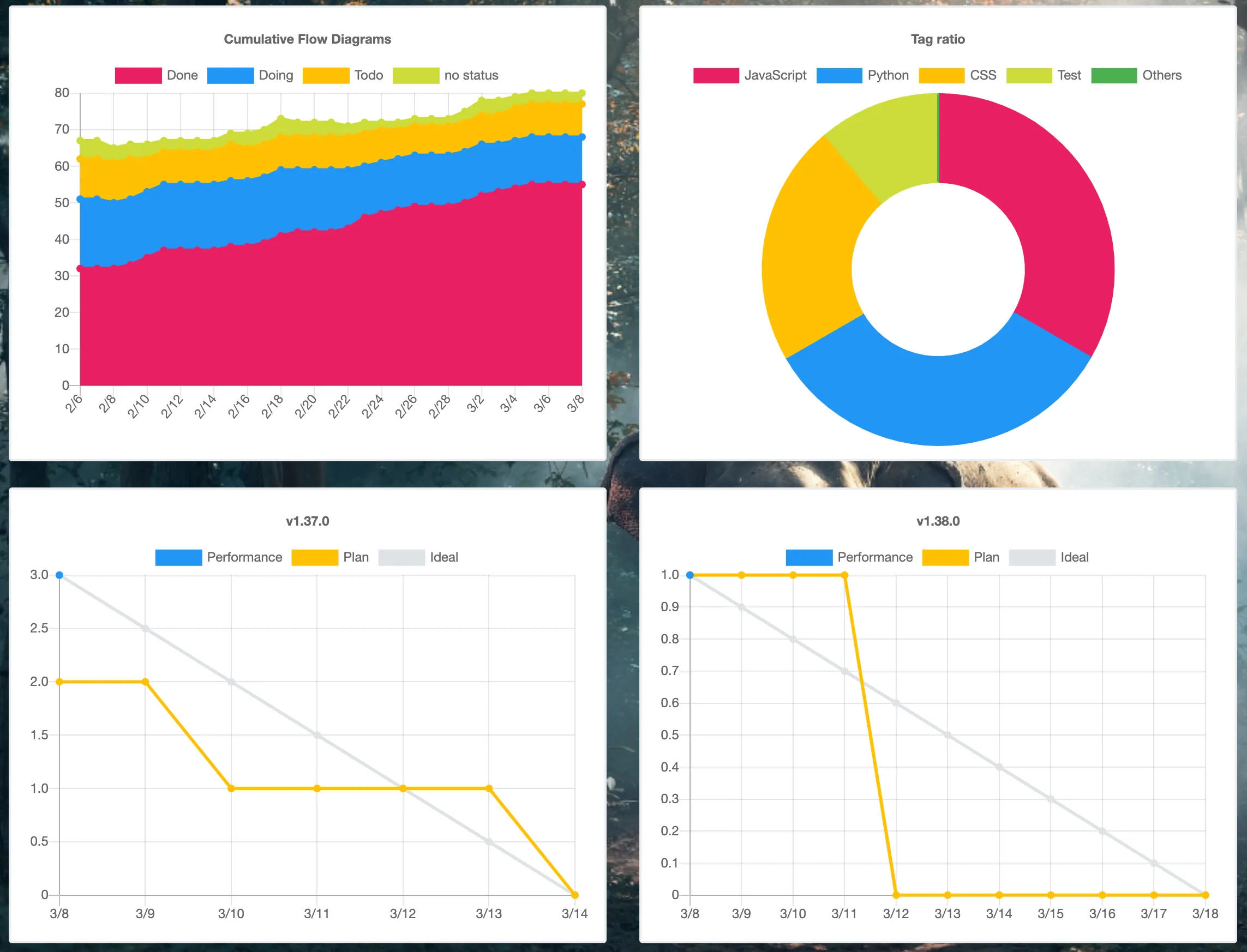
Cumulative flow chart
Shows a stacked chart of task statuses across the project. You can see at a glance how many tasks are not started, in progress, and completed.
Tag breakdown
Shows the proportion of tags in your project. For example, if you tag tasks with department or category, you can quickly see whether work is skewed toward a particular tag.
Burndown chart
Shows how many unfinished tasks remain and the pace required to reach the milestone due date.
Gray is the ideal line, yellow is the planned line, and blue is the actual line. The planned line is calculated from due dates set on tasks. The actual line shows the number of tasks that have reached Done (completion status) by each date.
Other charts
We plan to add more charts to help visualize team productivity. Repsona is continuously improving.